Flight Status - How we redesigned one of BA's most crucial tools with a 25% increase in customer satisfaction
 Me - (Product Designer)
TLDR
- Re-designed BA's flight status tool - with over 4 million visits per week
- Achieved a 25% increase in customer satisfaction score post re-design
- Fully WCAG 2.2 accessible using 100% BA design system components.
A bit of background
The tool was built on an old tech stack and was becoming difficult to maintain. We were also phashing in our new design system components (BAgel 2.0) across our digital products - this would be one of the first tools to properly utilise them.
The origin of the existing tool was pretty much unknown. There were some heatmaps and basic usage metrics, but no designs. We really needed to understand the tool and the customer's needs before we could start designing and building.
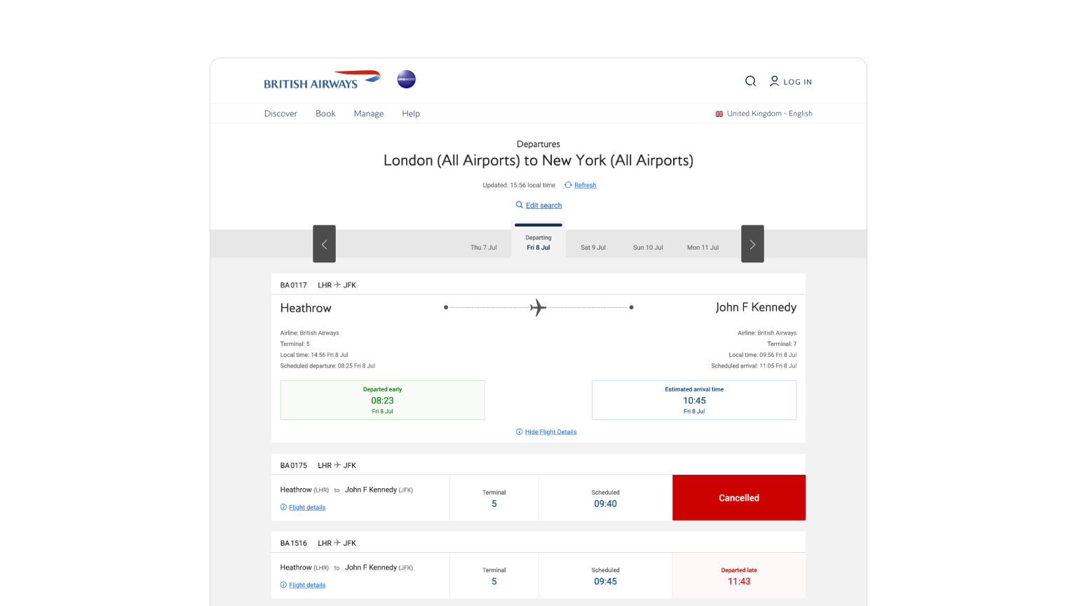 The original flight status UI
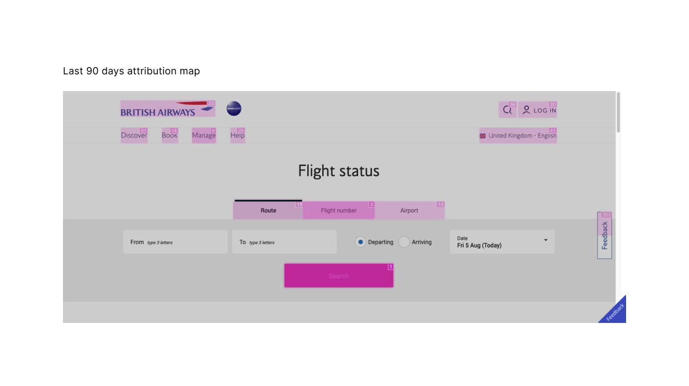
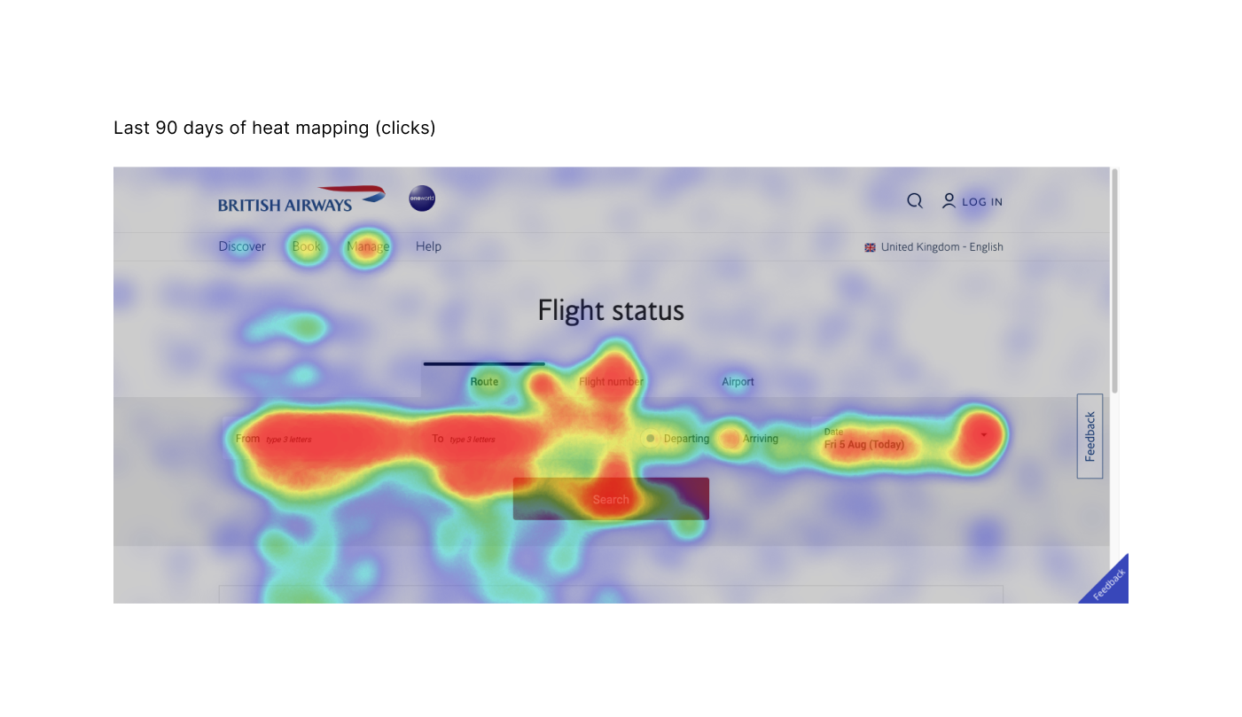
Early Analytics
We had a few data points and heatmaps of where people were interacting on the old too. These gave us some insight into not what to change and also what to keep. We really didn't want to re-invent the wheel with this redesign as we knew it already did the job and did the job well.
Some initial questions
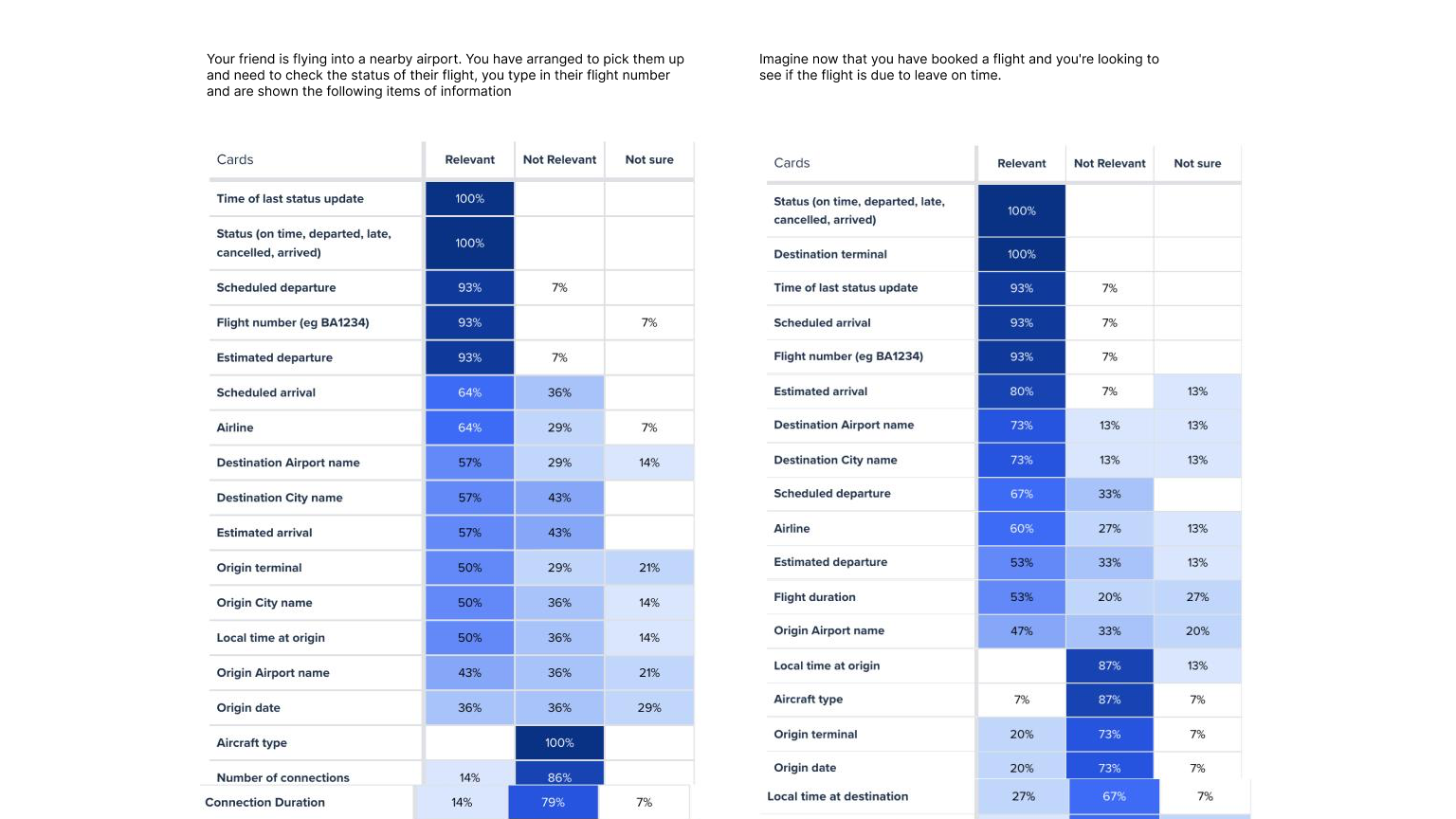
We knew roughly that the basic functionality would remain the same. It was the same APIs, service and architecture. One of the first questions we had however was: Why are people coming to this tool? What information are they looking for? and of what importance does each level of information have?We had a rough idea, but I started off with a card sort to try and nail this down. I took all the information that the current tool provided and asked candidates to sort them into categories: "Relevant", "Not Relevant" and "Not Sure". We would then use this to benchmark what pieces of information to prioritise in the UI.
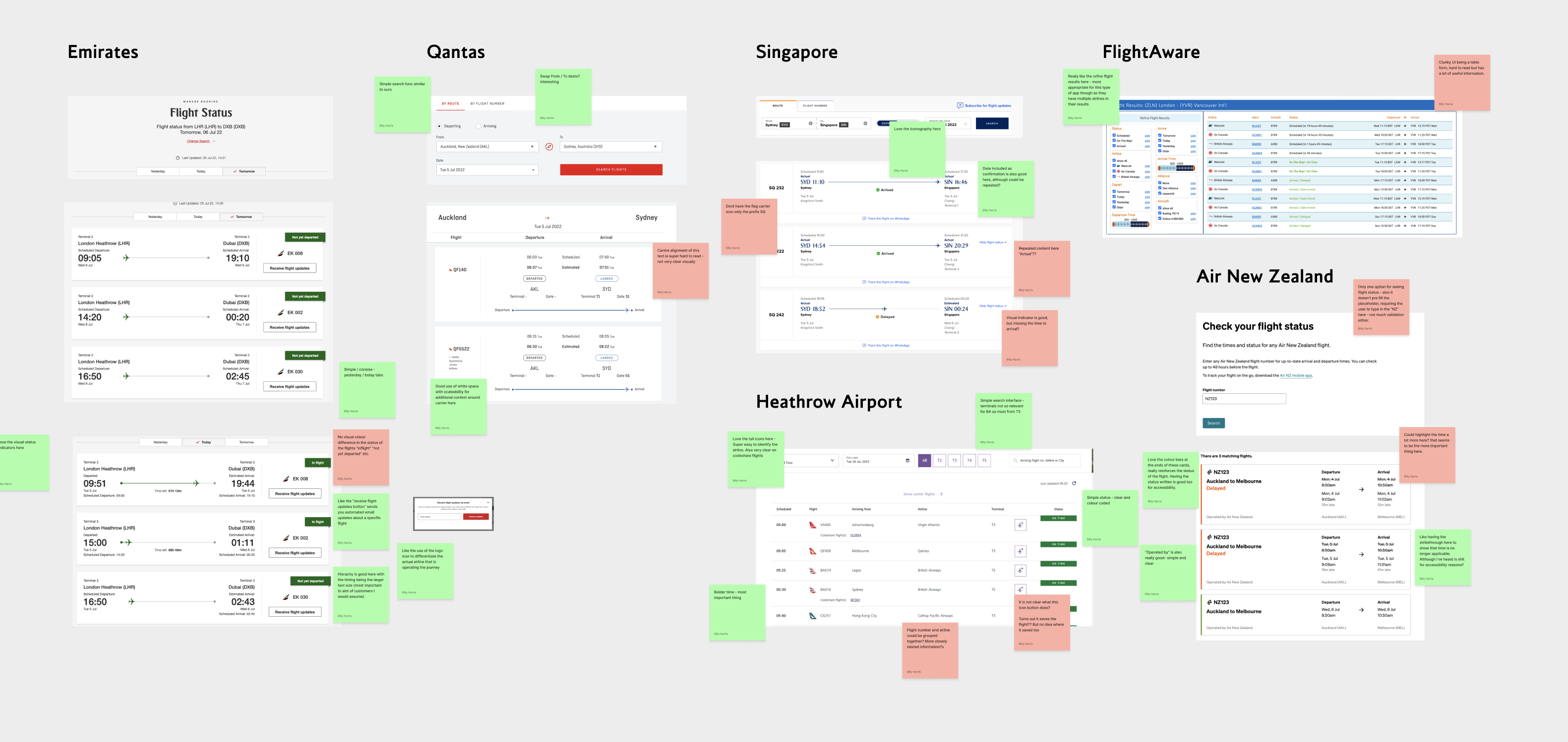
Competitor analysis
I ran a workshop with our design team to gather some competitor analysis to see how other airlines handled flight status information. Noting and voting on what we liked and didn't like from various other airlines and digital products.
The landing page and search
The search parameters for this tool largely remained the same due to the requests to the API. The main effort on this screen was translating the requirements to our design system components. Initially we wanted a tabular structure here similar to the initial design to break up the search modes.
Tabs pose accessibility and translation issues especially when used on mobile. We opted for using radio buttons with added screen reader context for updating the state. We also needed to fix some understandability issues with searching for display times. Other updates including left aligning text, and updating taxonomies to be more contextual. Eg. "Show departing times" instead of just "departing".
The results screen and details
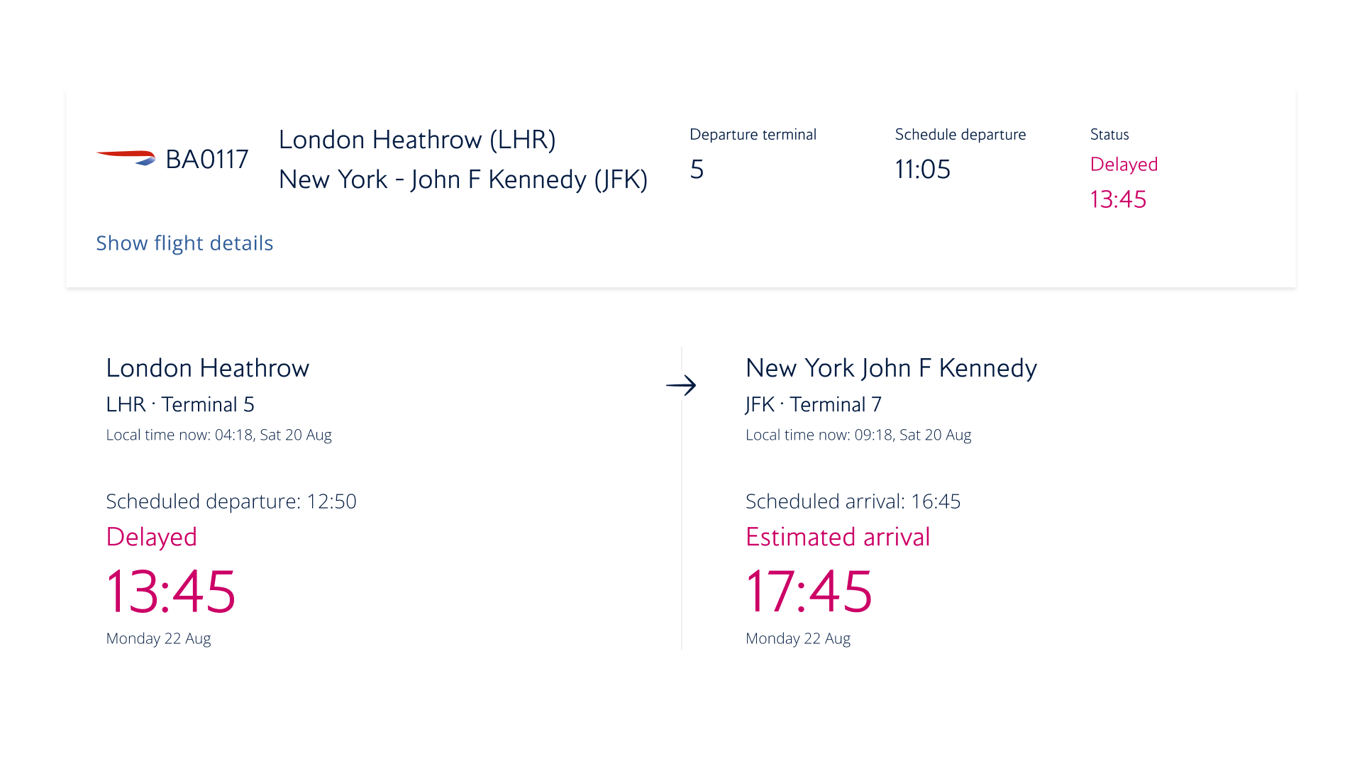 Desktop version of the flight card UI and flight details section.
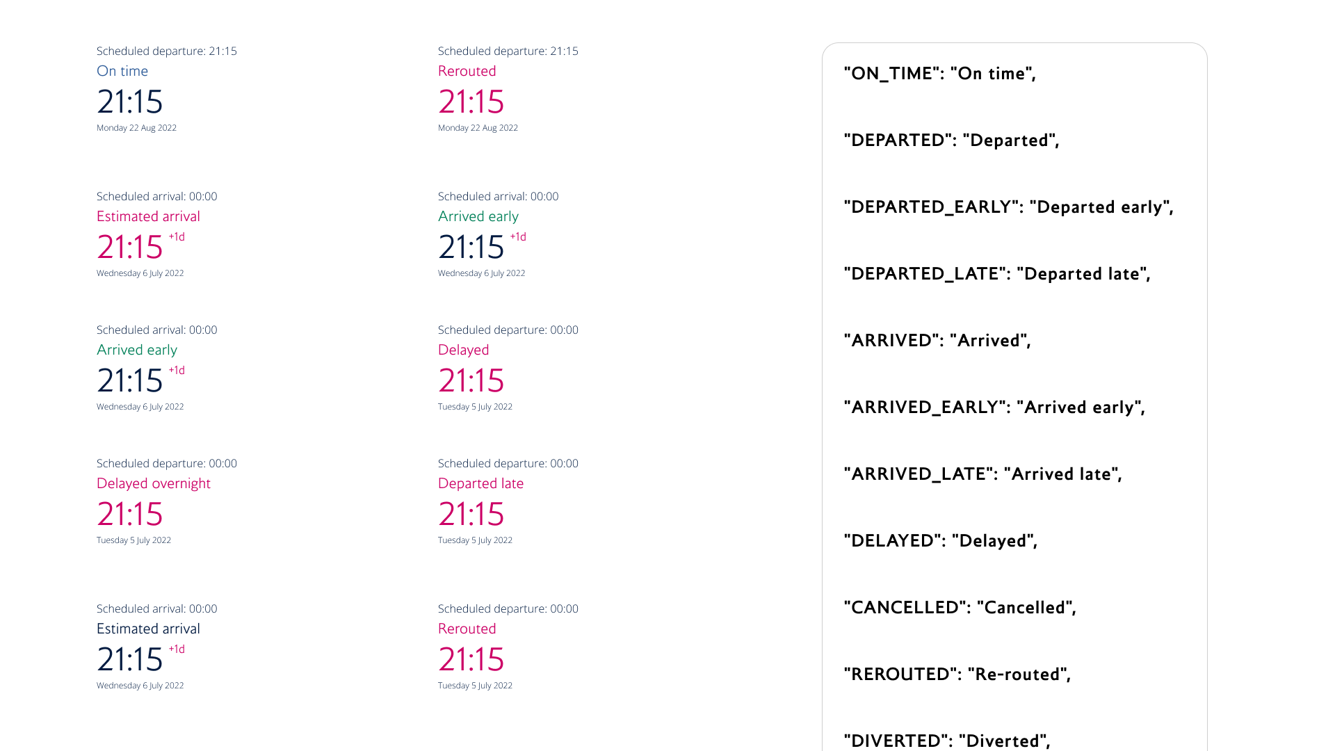 We also had to accomodate for 12 different flight status states served from the API - all with different UI.
Outcomes and successes
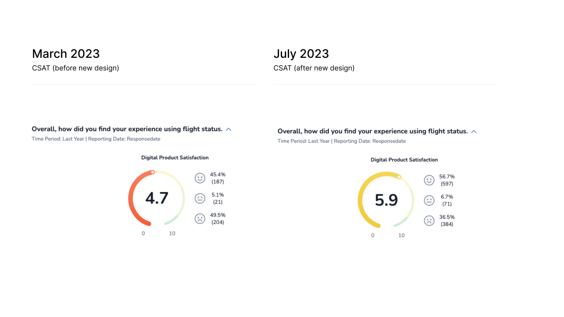 Customer satisfation metric improvements
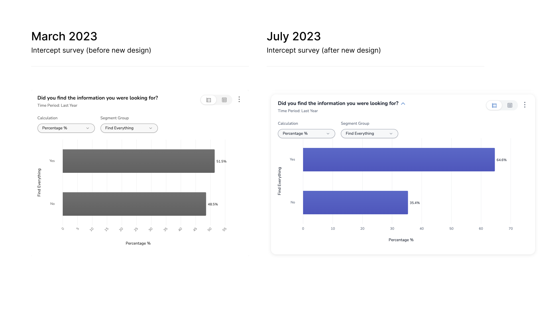 Intercept survey improvements
Bumps in the road
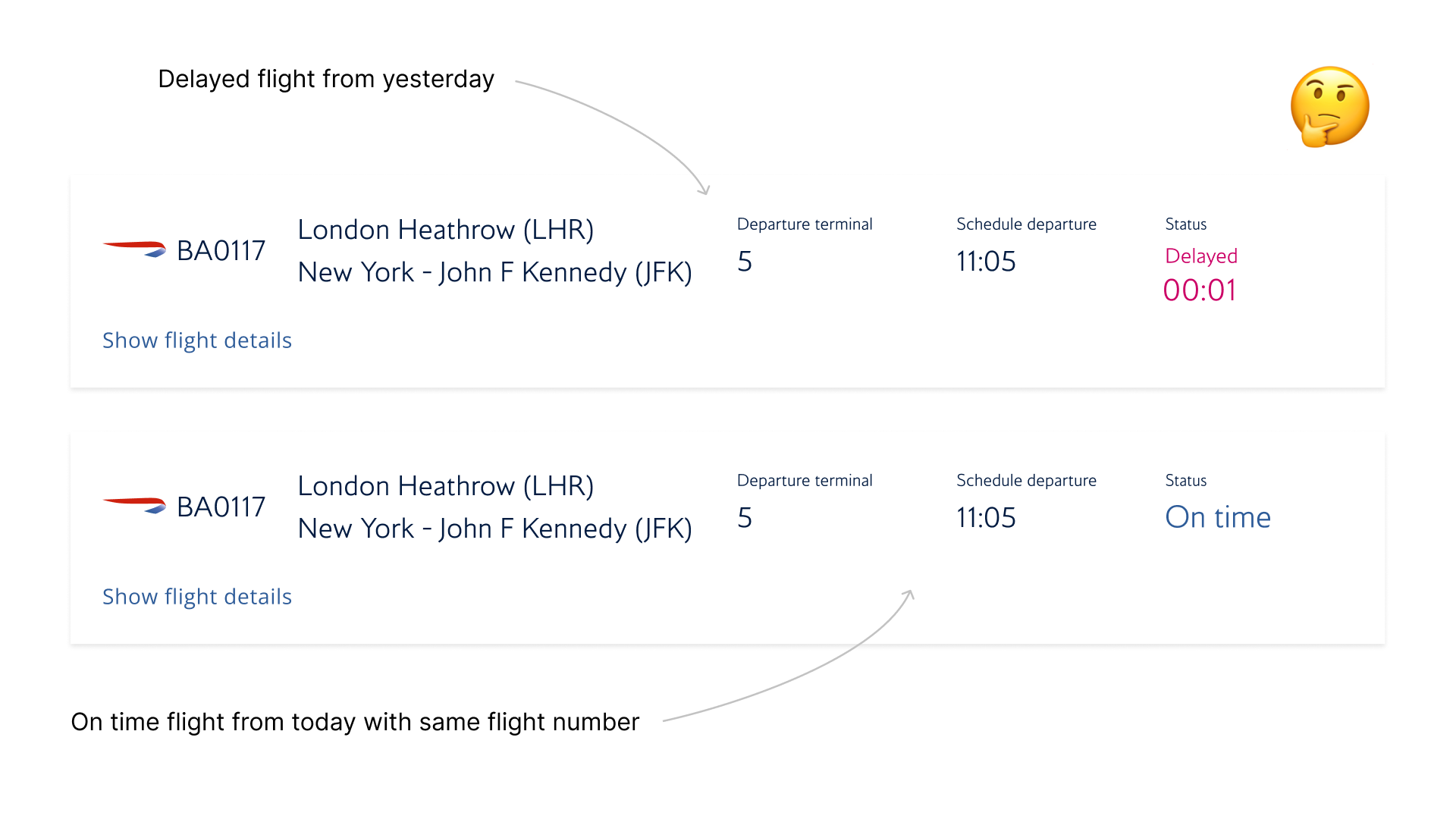 Example of a flight with the same flight number showing up in the results of the next day