BiO - Reimagining maintenance requests and management for building engineers
2021
 Me - (UX Lead))
 Gareth (Design Director)
 Bev (Senior UX Researcher)
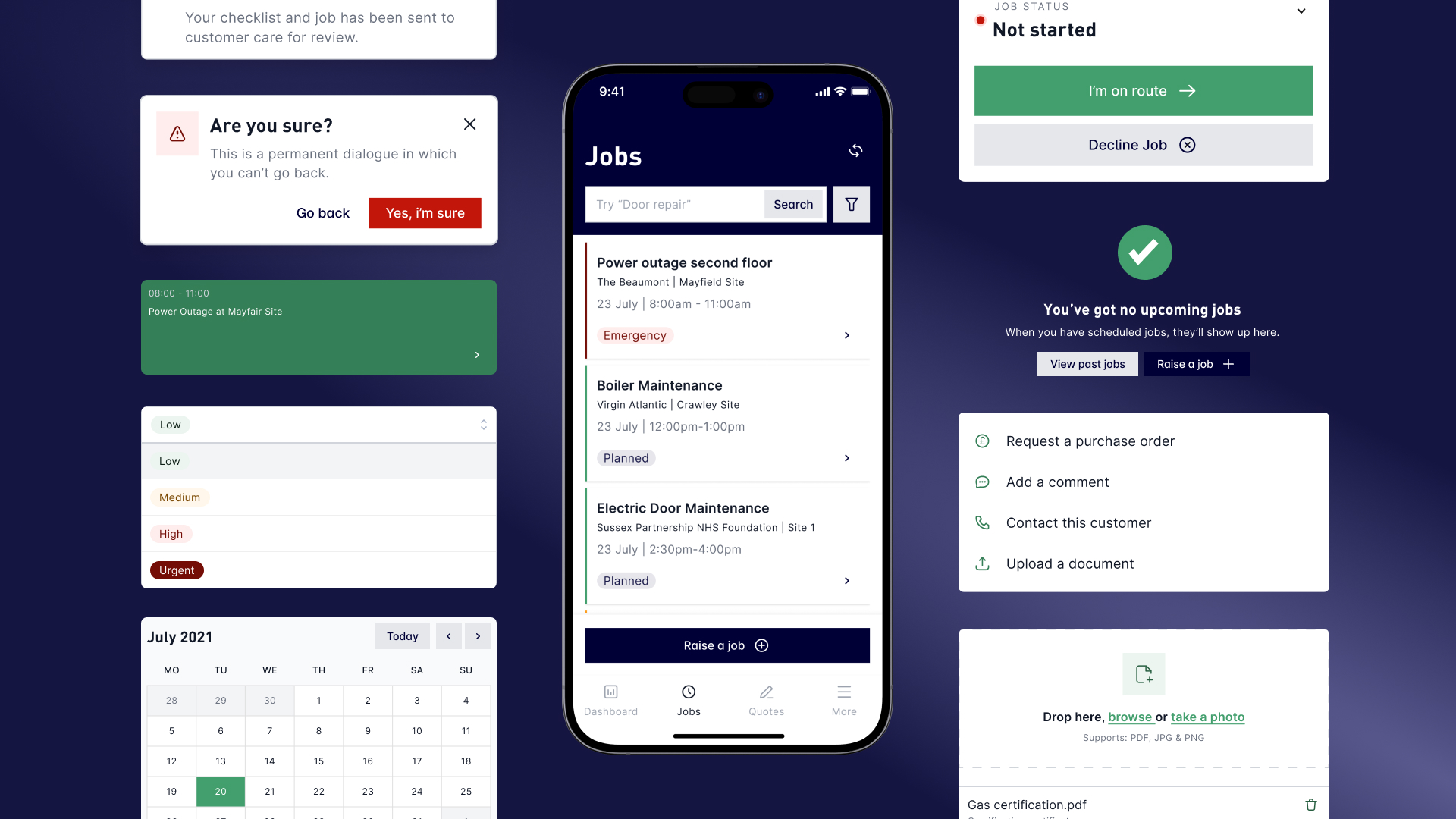
A bit of background
Some of the initial problems we needed to solve were:
- No visibility of system status anywhere
- Buttons & text failed accessibility
- Full width text inputs and poor hierarchy on desktop
- Inconsistent taxonomies and labeling
- No onboarding or direction of user flow
Engineer Interviews
Myself and our researcher conducted some engineer interviews and gathered some insight into some of their issues with the current BiO app. We then used these to form key tasks, JTBD and personas for the engineers.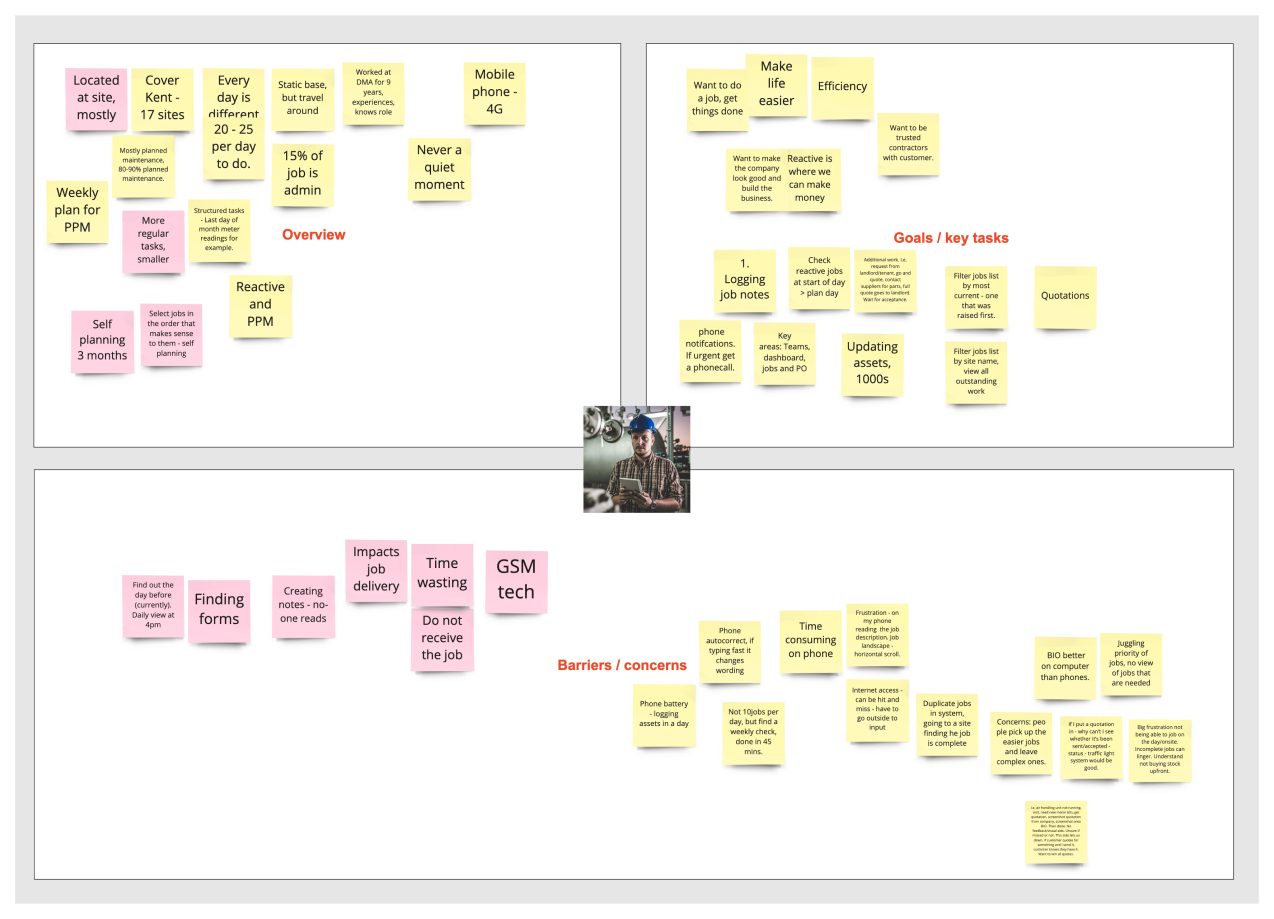
Project scope
Because BiO is was an enormous app, we focused on 5 main flows to focus on and develop. These were the ones we felt could do with the most improvement and have the most benefit for the users and the business. We focused on:
- Global Navigation
- Inspect job / completing checklist
- Starting job / updating job status
- Raising a job
- Inspecting a quote
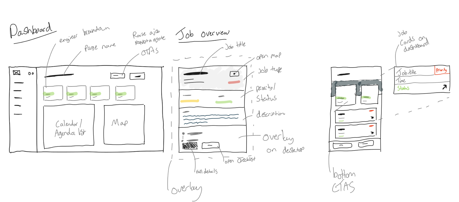
Low fi mockups
We developed these out into some more solid greyscale wireframes. This is also where we started to define the main call to actions and navigation structure.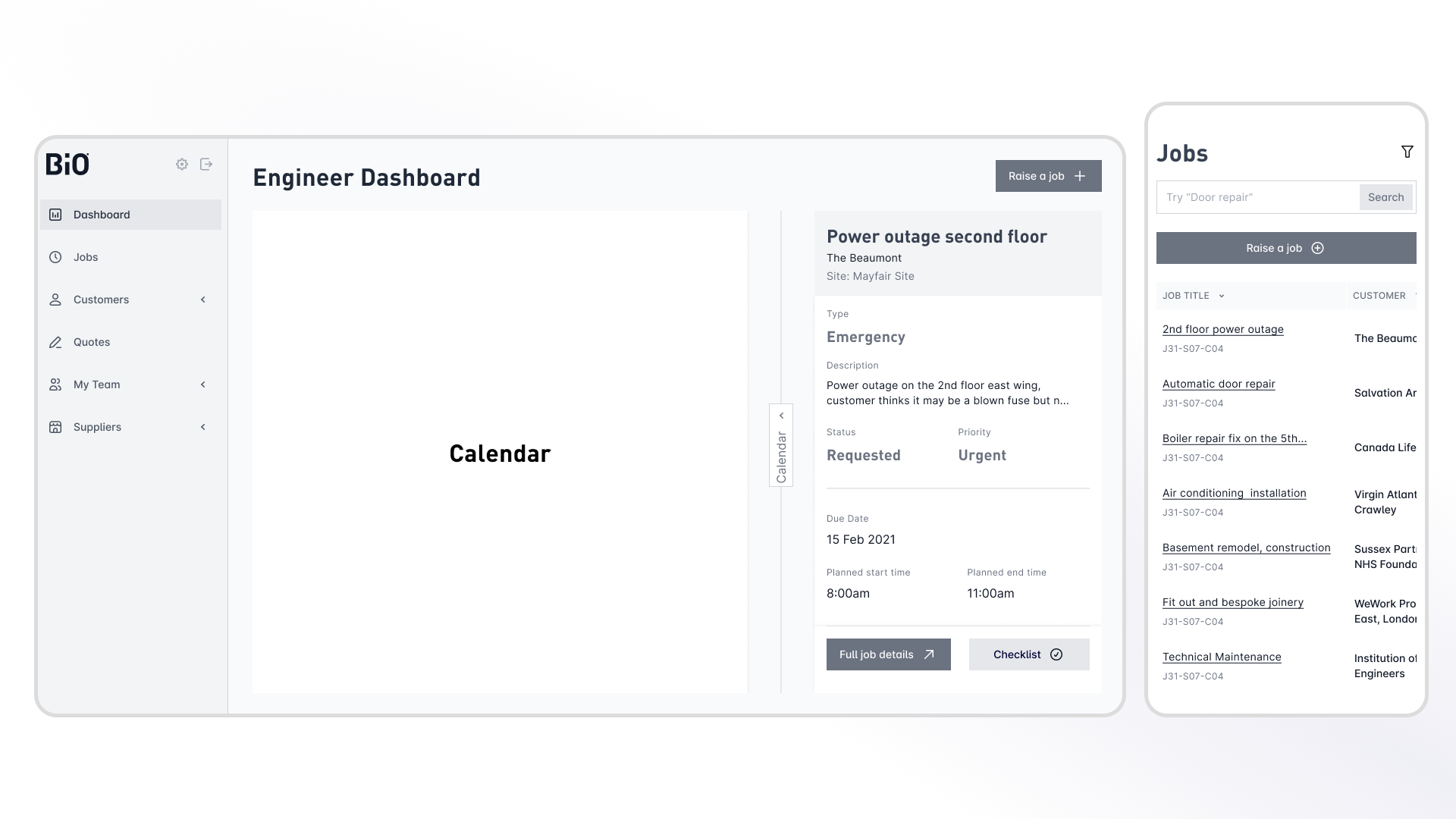
Starting on the component library
We started to develop a component library to determine exactly what elements we could re use. This allowed us to start getting feedback incrementally on the UI and to make sure we were staying on brand.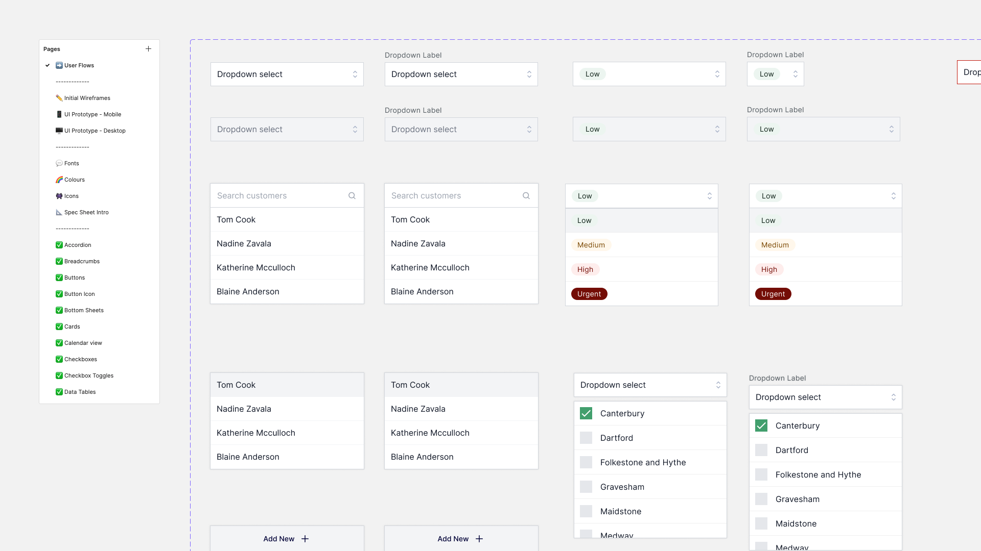
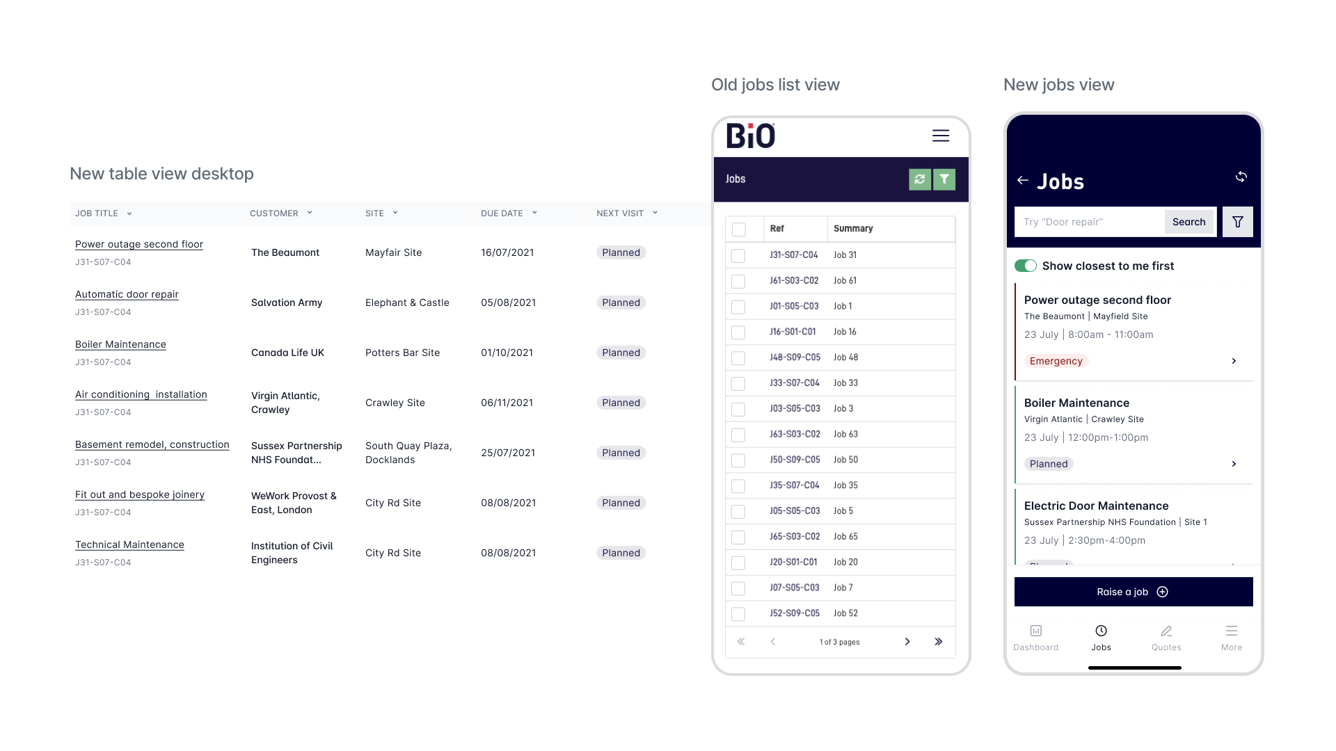
Tables into Cards
Almost every screen in this app was a table view. Engineers were constantly on the move and almost always on a small device such as a tablet or a phone. They mentioned the data complexity as a big pain point. We needed to find a way to simplify and surface the right data at the right time.
Documenting patterns and design decisions
This was a scoped project just for design work. The client needed precise documentation of patterns and design decisions to hand over to their development team.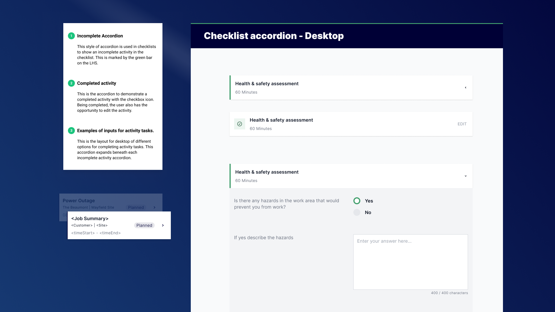
Inspecting a job
Completing a checklist
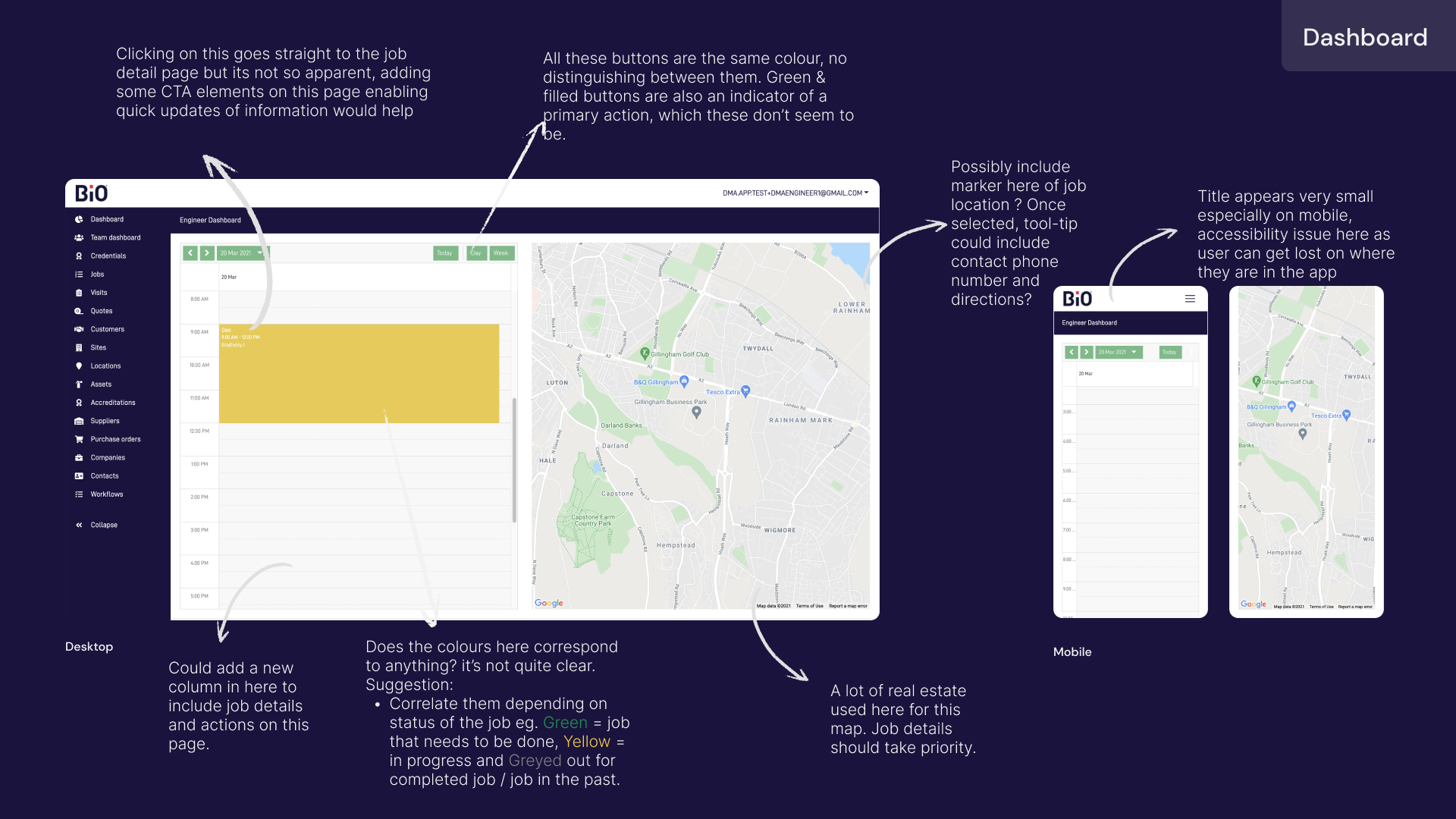
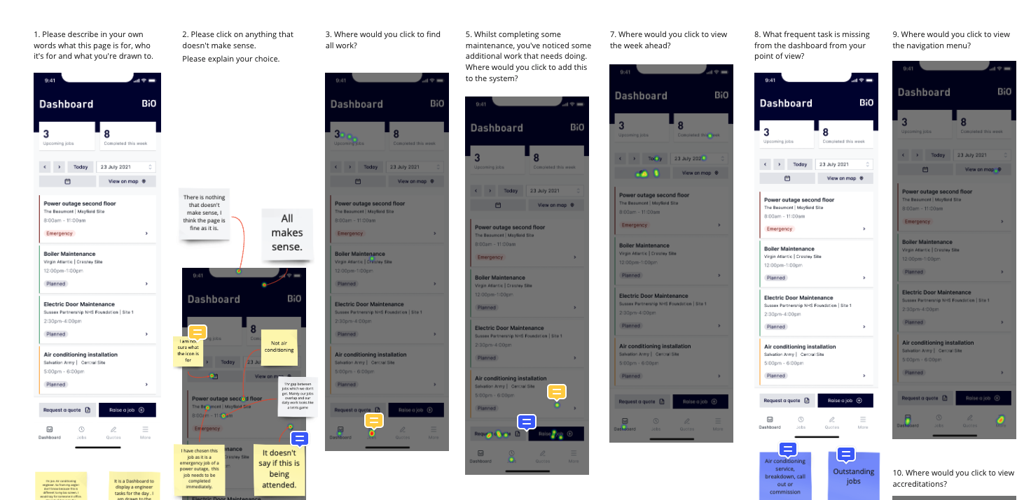
Validating design decisions
Since prototyping we've been able to gather insights from real engineers putting them through usability hub and collecting heatmaps.
Where the project ended up
This was a timeboxed piece of work, we had 8 weeks to get this out the door from inception to design validation.
We went through a few rounds of testing with engineers and the client to ensure we were on the right track.
At the time I left Red Bullet, the client had started the build phase of the new app in Angular, using our new component library.