TL;DR
- Led design for Filter Groups in Contacts, Typeform’s lightweight CRM experience
- Solved a messy interaction problem around grouping filters with AND/OR logic
- Worked across product, design, and engineering to make the logic clear and buildable
- Tested the pattern with 5 users from our saved lead-gen template group and used that to tighten the final solution
- Helped shape a wider Contacts experience measured through contacts enriched, active automations, completion rate, and email engagement
This project sat inside Contacts, which is Typeform’s lightweight CRM feature.
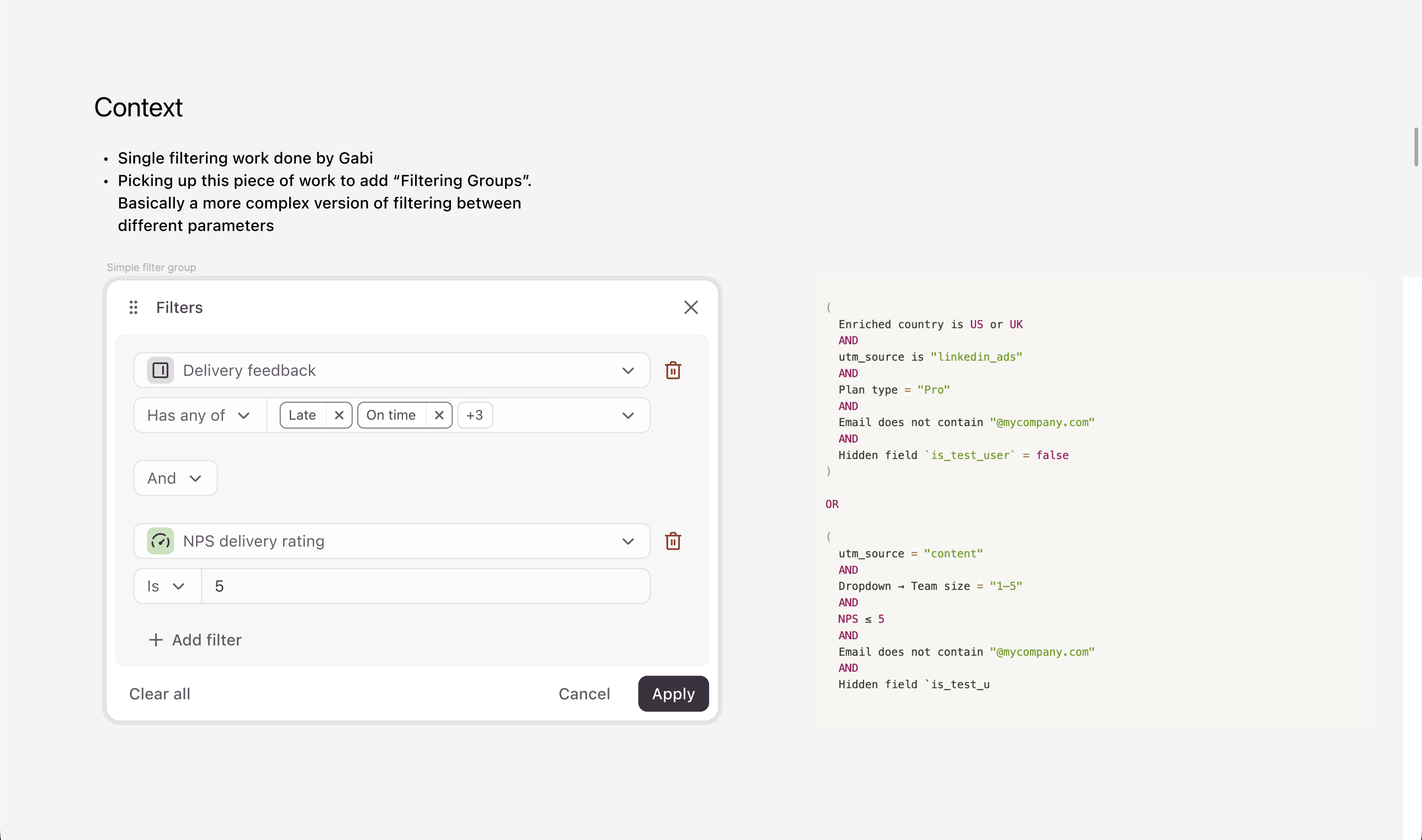
This was the original filter feature — you could add multiple filters but not filter groups. The code snippet on the right was what we planned to implement. My focus was Filter Groups. Filtering already existed in Contacts and worked fine for simple cases, but the moment the team wanted proper segmentation, the flat list of filters fell apart. People needed a way to build more layered logic without the panel starting to look like a database query builder.
The challenge
Filter Groups sound simple on paper. The behaviour gets messy fast.
The job wasn’t to drop in another UI element. I had to define what a group actually meant inside the product, how filters should behave inside a group versus between groups, and how much logical complexity was worth exposing at all.
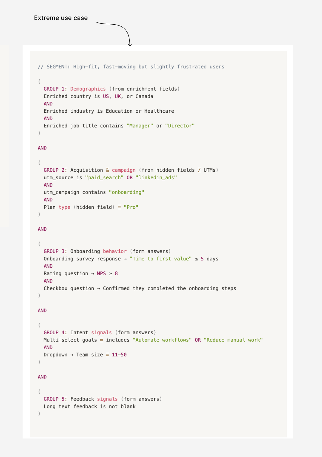
On one side, product needed something powerful enough to support real segmentation. On the other, engineering was already shaping the filtering model and there were real constraints in the existing composer and panel structure. So the job wasn’t just to make something look good. It was to define a filtering pattern that made sense conceptually and could actually be built, but was also familiar and simple to Typeform’s users.
There was also an important scope boundary: we didn’t want to go as far as nested groups. That would have made the whole thing much more technical, much harder to explain, and probably too heavy for where the product was at that stage. So the challenge became: how do we make grouped filtering useful enough to matter, while still keeping it simple enough to understand?
What I did
I worked on the logic before the visuals.
I went through the existing filtering work with engineering, looked at how the wider structure was being shaped, and mapped where Filter Groups would add extra friction for users.
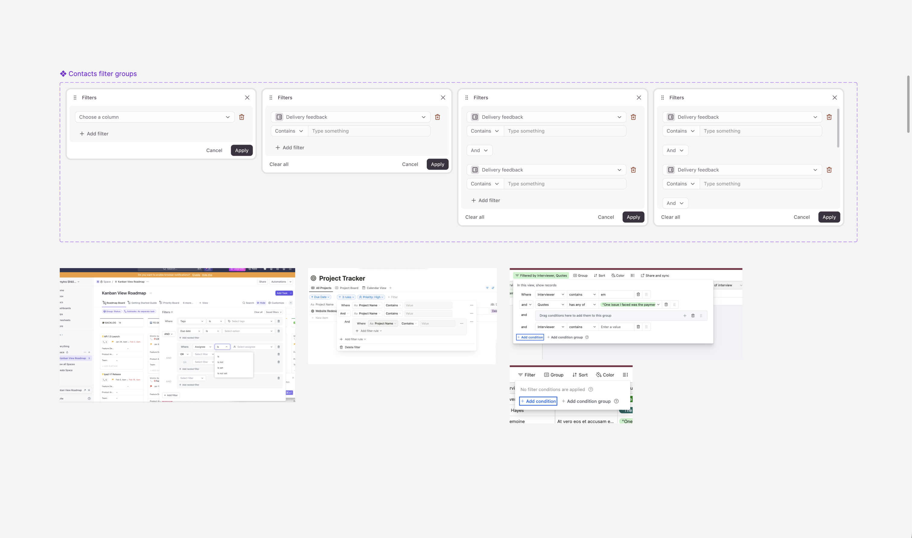
Some early benchmarking around the existing filtering logic. The first thing I worked through was how grouping should actually behave:
- Benchmarking how other tools handled similar filtering logic
- When a new group should be created
- How it should relate to existing filters
- How much visual weight group containers should carry — enough to make the hierarchy obvious, not so much that the panel felt like a query builder
- Where AND/OR logic should live
- What should happen when someone adds a group after they’ve already built filters
The AND/OR problem
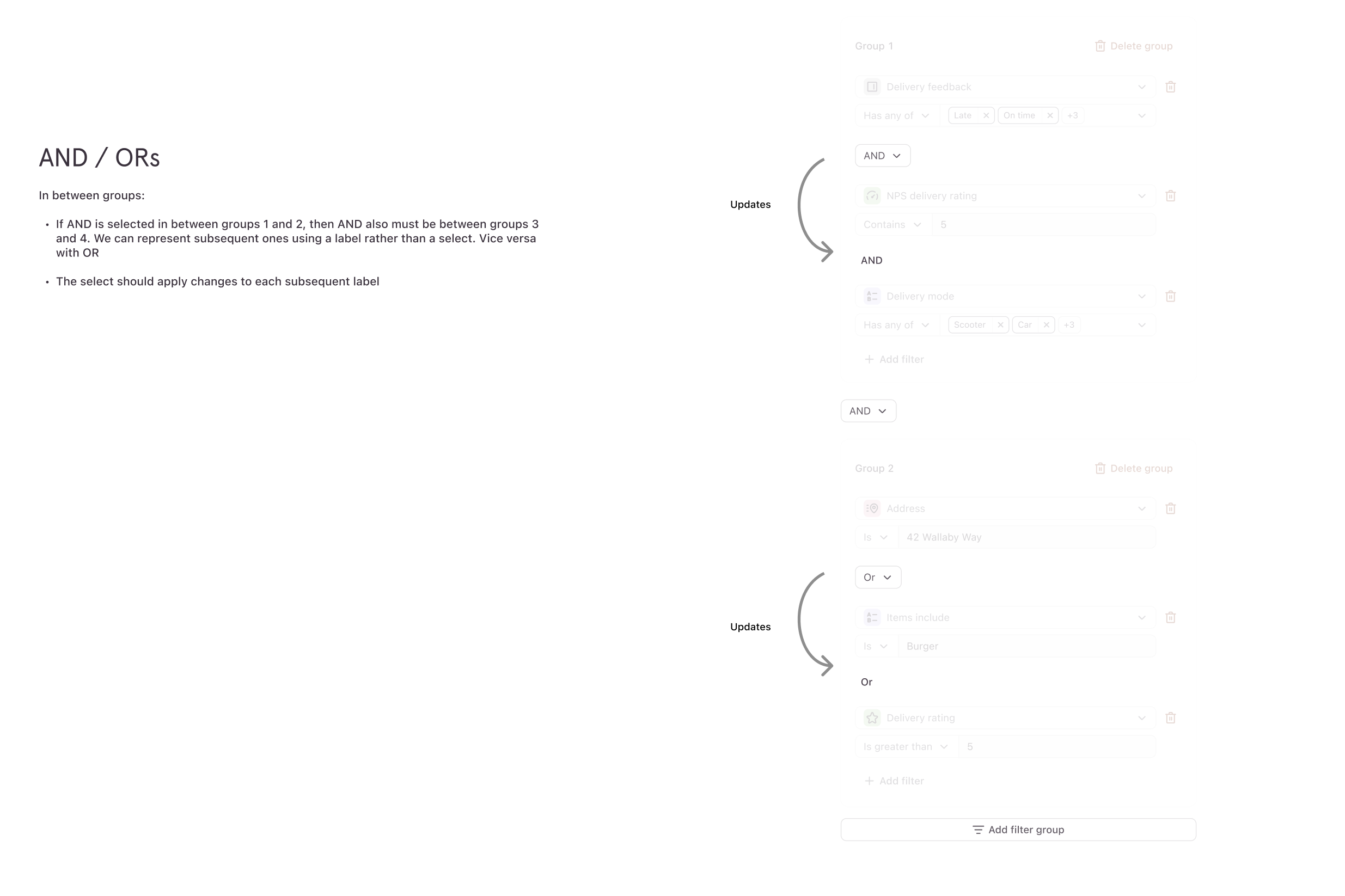
The hardest part of this project wasn’t visual — it was working with complex operators, without adding massive complexity to the user, specifically for AND and OR operators between groups of filters.
We used one rule: don’t mix AND and OR at the same level.
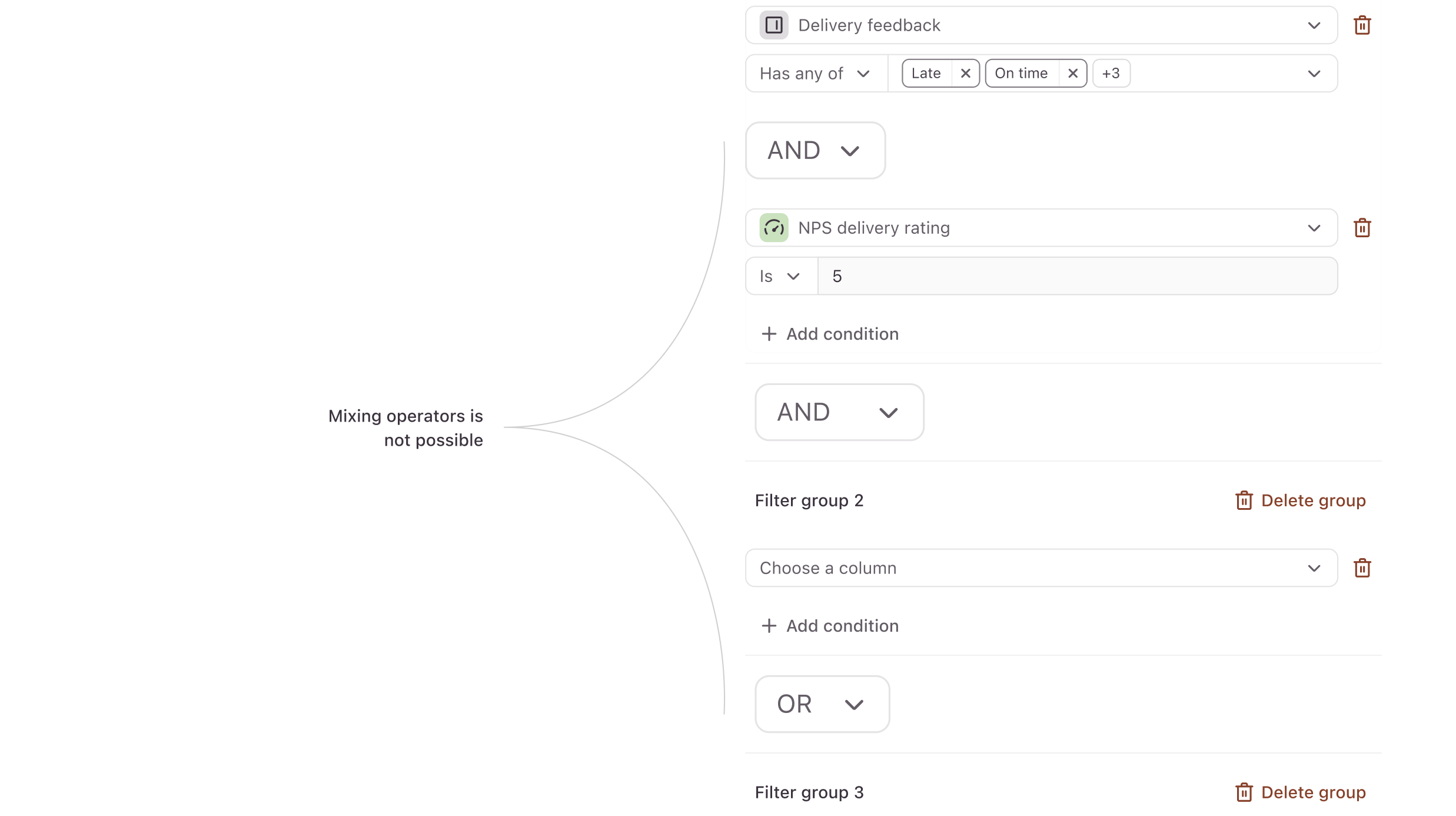
Within a group, all filters share one operator (all AND or all OR). Between groups, groups are joined by one operator. In the UI, this meant that AND/OR configuration on the top level had to be fixed on the filter groups further down the page. For example you could have:
<group1> AND <group2> AND <group3>
But not:
<group1> AND <group2> OR <group3>
By locking each level to a single operator, we got three things at once:
- No ambiguity. A group always evaluates one way. There’s no hidden precedence to learn.
- A predictable simplified UX. The AND/OR control sits at the group level, not next to every filter. Users set it once per group and move on.
- A clean engineering contract. The data model becomes “a list of groups, each with an operator and a list of filters, joined by a top-level operator.” That’s something engineering could build against without edge cases multiplying.
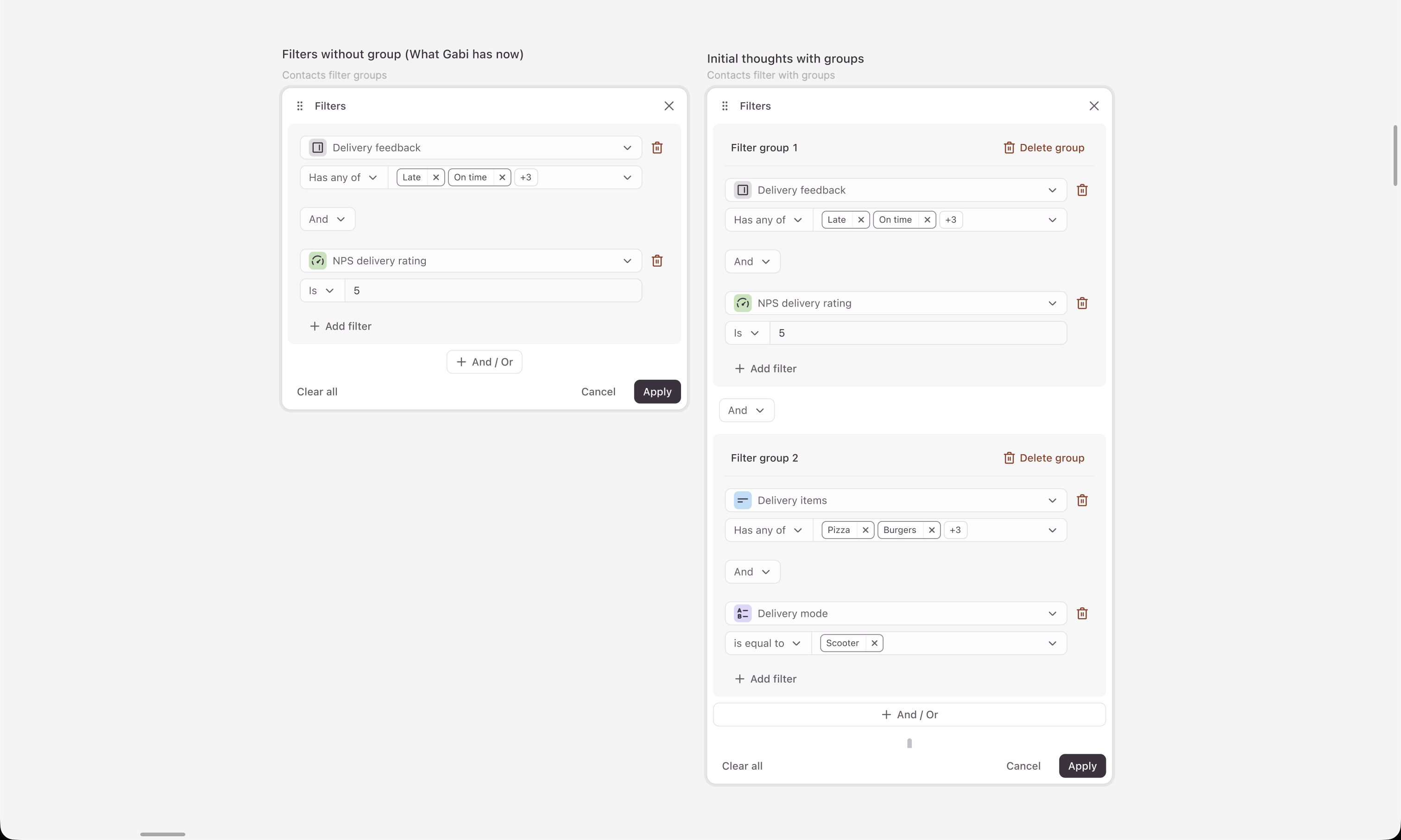
In an early version, adding a new group could reshape filters that were already there. Technically buildable, but from a user point of view it felt off — the system was rewriting your logic without asking. That was the turning point for me. The real design problem wasn’t visual clarity, it was predictability.
Further iterations
From there I pushed the interaction and UI to make groups feel deliberate. When someone adds a group, it should feel like they’re intentionally creating a new layer of logic, not accidentally changing the meaning of what’s already there.
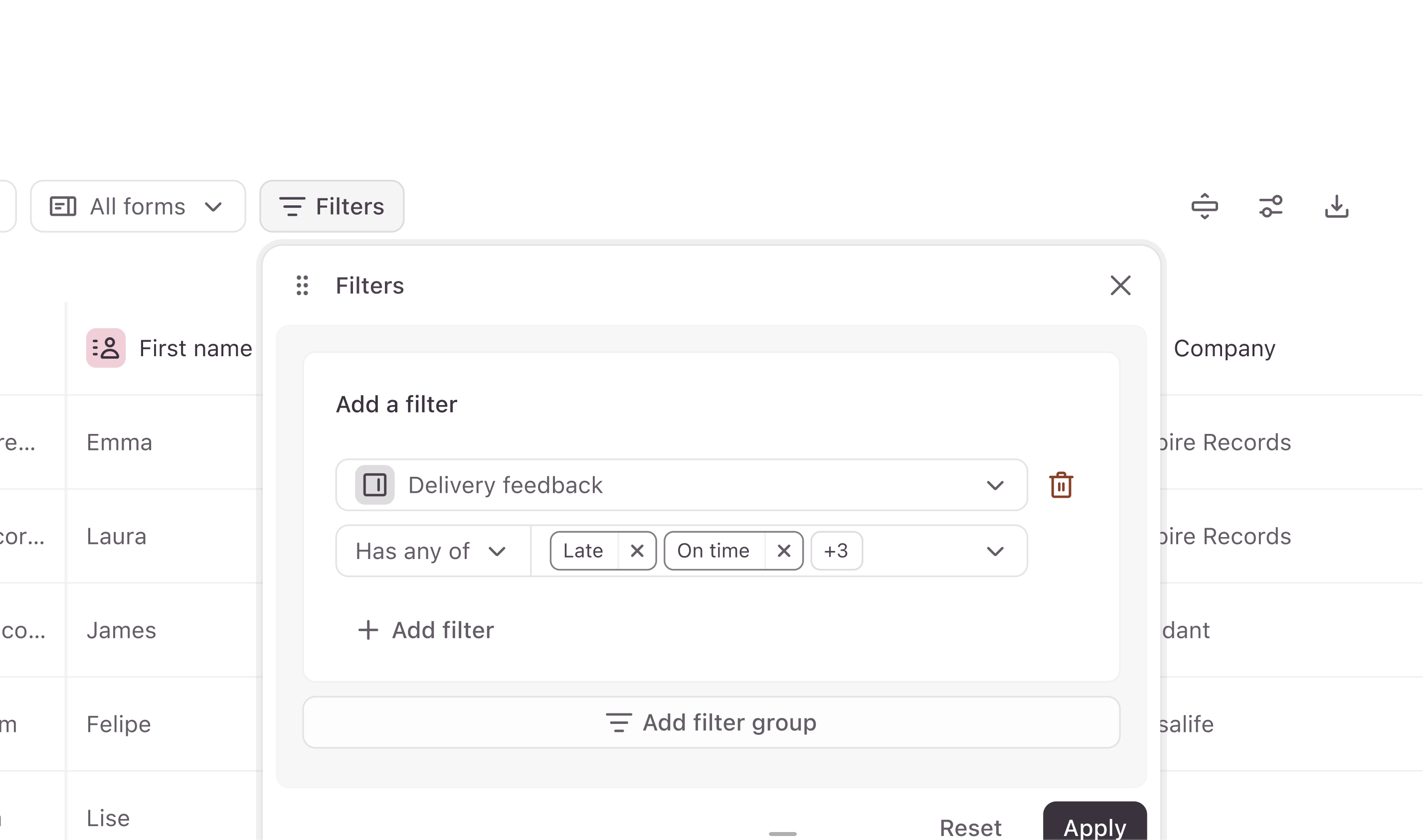
Most of the work sat in the details:
- Making the hierarchy between filters and groups read clearly
- Working out how much emphasis the group containers needed
- Getting empty and default states right
- Handling incomplete states and validation
- Keeping the logic simple enough that the UI didn’t start to feel like a query builder
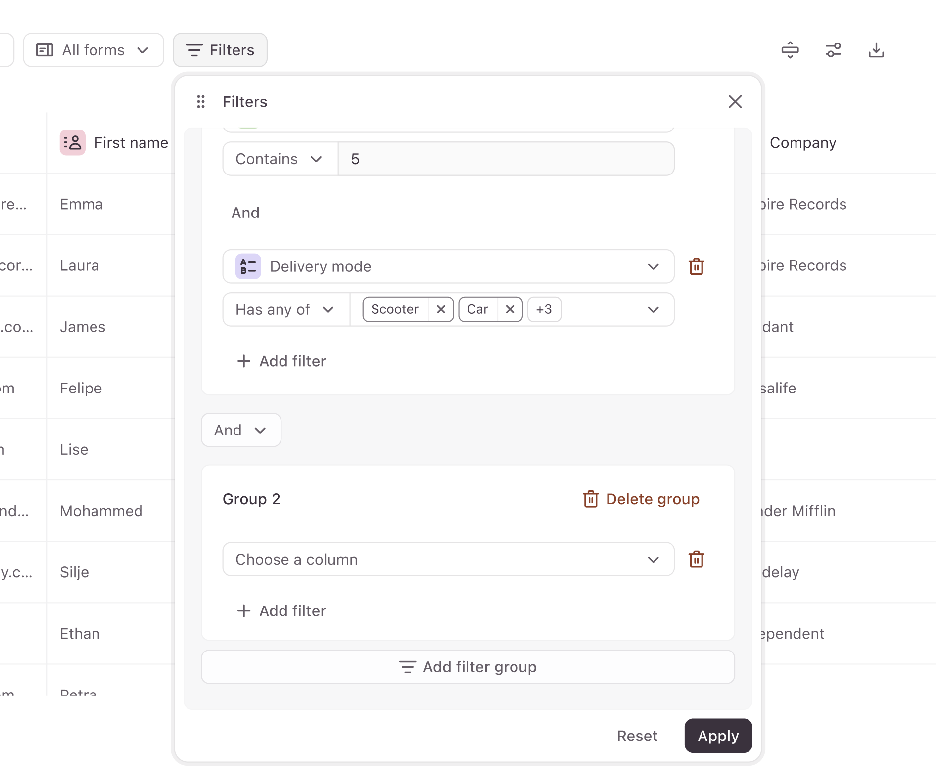
Separating groups into an individual card with the ability to add a new filter group.
Validation
Because this pattern was more involved than a normal filter flow, I wanted to check whether people actually got it. I ran a usability test with 5 users from our saved lead-gen template group — marketing, BD, and research/sales. The goal was to see if the interaction model, structure, and expected behaviour held up once people started using it.
The model broadly landed. Most people assumed AND/OR options existed before they ever opened the dropdown, which was a good sign that the mental model matched their expectations. With filter groups specifically there was some initial hesitation, but the moment people saw the UI shift as they grouped filters, they understood the two sections were filtering separate sets of data.
A couple of useful surprises came out of the sessions:
- One user expected regular filters and filter groups to behave like saved filters, which lined up neatly with a future “saved filters” feature the team had been considering.
- Another user pointed out that an “OR” between groups felt more natural than the “AND” we had in the example — useful input for how we framed the defaults and the dropdown copy.
“Ok so we have our individual filters stacked inside filter groups… this makes less sense in this example that they’re AND conditions, but if the groups were separated by OR conditions it would make more sense to me.”
One user on a small screen didn’t see the “Add filter group” button at all — it sat below the viewport. That turned into an implementation note in the handoff: the draggable panel always has to stay within the viewport height.
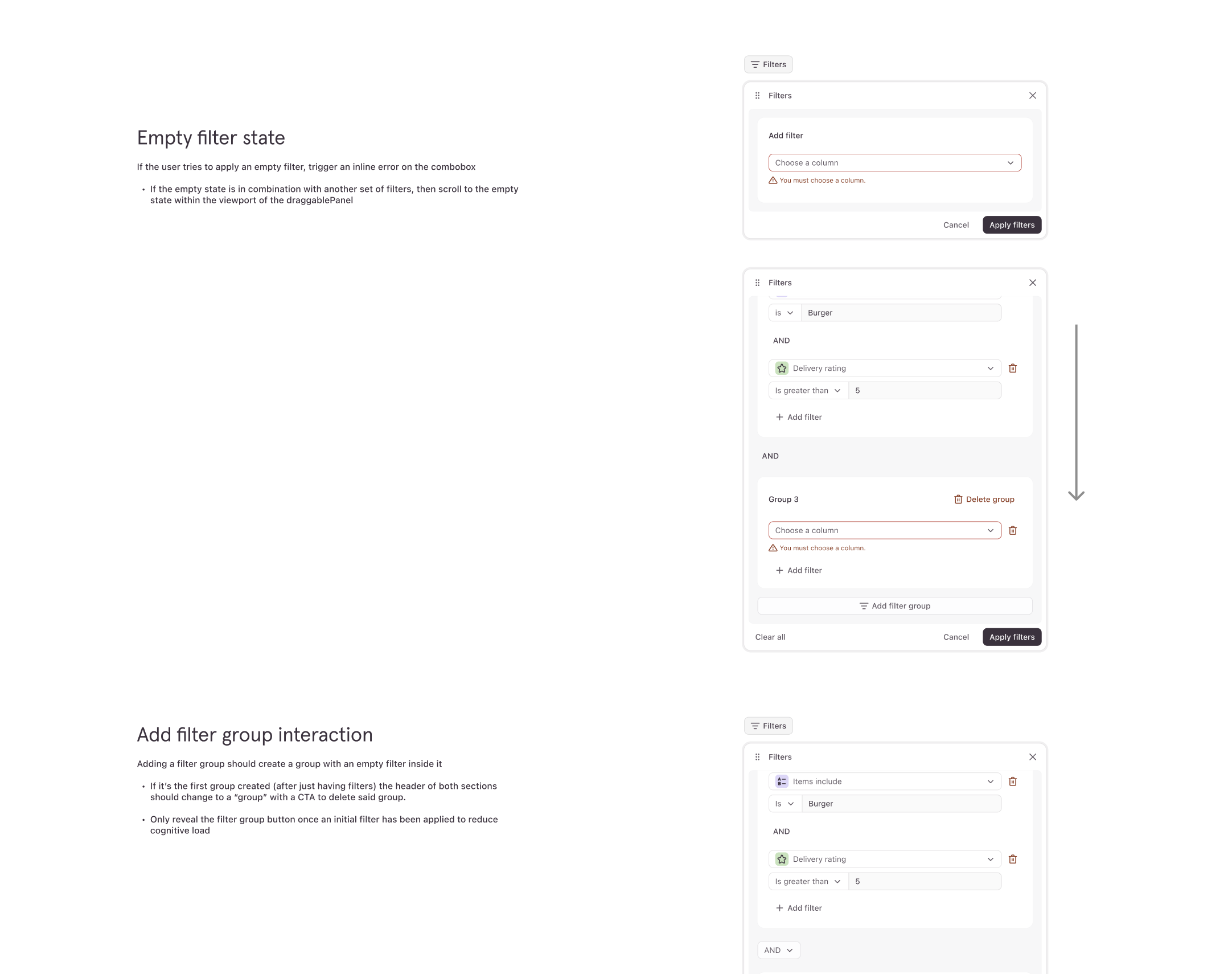
Anatomy for handoff
I added a breakdown of this complex logic and included all the edge cases for handing off to engineers.
Where this sits and what it shipped
Filter Groups shipped as part of the wider Contacts experience in Typeform — a lightweight CRM layer built on top of forms, designed to help teams capture, segment, and follow up on leads without leaving the product.
The success of Contacts overall was measured against four things:
- Contacts enriched
- Active automations
- Completion rate
- Email engagement
For Filter Groups specifically, the bar was whether people could build segments that previously weren’t possible, and whether they could do it without needing support to understand the logic. Both held up in testing, and the AND/OR-per-level rule was the thing that kept the feature usable as segmentation got more advanced.
Reflection
The most interesting design work on this project wasn’t on the surface. It was in shaping the behaviour of the system — defining how it should think, what it should let users do, and what it should protect them from — and then making that legible enough for a small team to build, ship, and explain without a manual.